Educopia
Educopia is a force for collaboration and knowledge sharing across libraries, archives, museums, grassroots groups and other knowledge communities. Building on their iterative strategic planning process, we created something much deeper than a visual refresh—a tangible, strategic reaffirmation of Educopia’s goal to do its part in helping shift knowledge systems toward diversity and equity.
Their new brand represents a promise to connect diverse knowledge communities with resources, power, and each other. The visual identity embodies the spirit of Educopia’s work, and is a reminder to their peers, partners and communities of their shared purpose: to create a sustainable knowledge landscape with reduced inequities and increased access to knowledge.
Role: Brand Identity, Design
Collaborators: Mallika Vora (Web Design & Development), Aloma Antao (Educopia Marketing & Communications Manager)
Previous visual identity
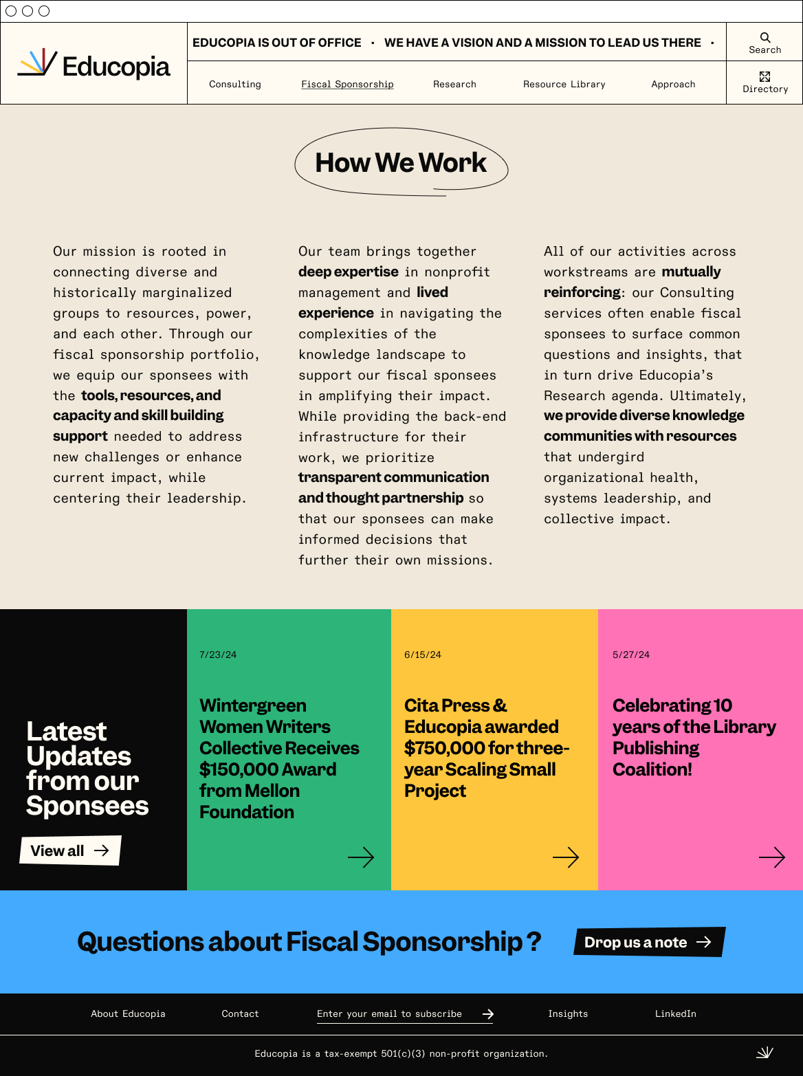
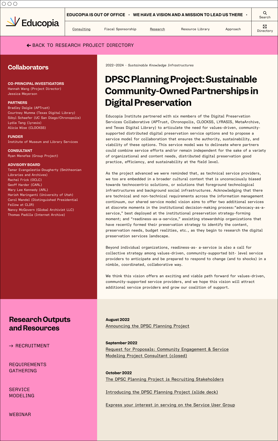
The previous website was dense with text and difficult to navigate. New audiences were unclear on what the organization actually did.
As part of our rebranding process we decided to drop the “Institute” from the organization’s name, which was a holdover from earlier days. We favored the simplicity of a single-word logomark.


Progressive, Collaborative & Knowledgeable
We began by exploring and choosing three key attributes to define the Educopia brand, setting the goal posts for what the new visual identity would communicate. These three words reflect how Educopia expresses itself through our tone, design, and attitude.


A logo that is constantly in motion
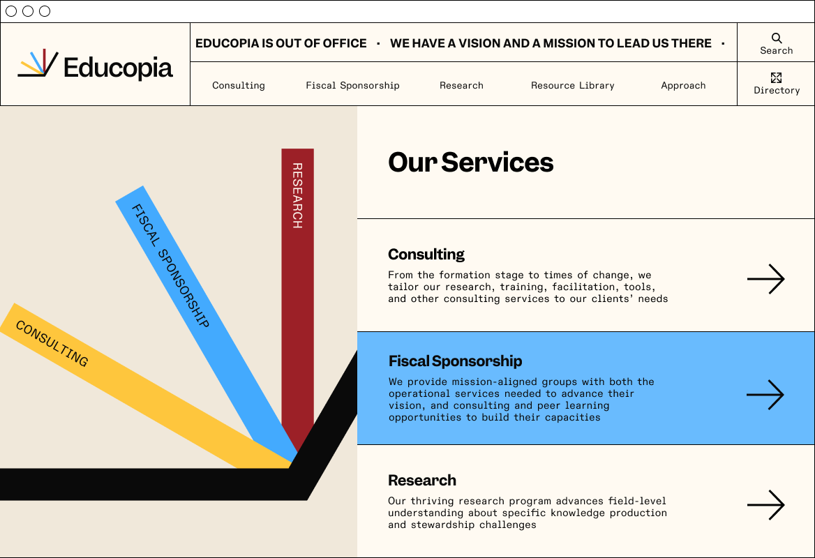
The new Educopia logo is designed to be flexible, allowing for multiple meanings while engaging with different audiences, programs, and sectors. It represents the diverse expressions of Educopia’s work while clearly highlighting the three distinct workstreams that define the organization.
As three colorful workstreams come together with insights and reach out to create connections and share resources, they are anchored by a stable foundation. This foundation symbolizes open information, open technology, and a welcoming space that helps advance the entire system together.




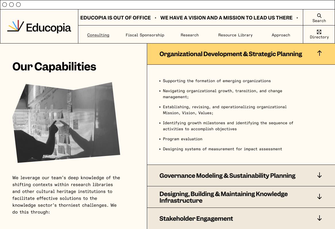
We created graphic shapes to symbolize Educopia’s core competencies and its position within the knowledge landscape. These metaphors emerged from strategic planning workshops.

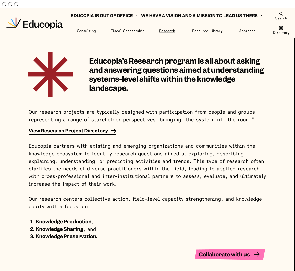
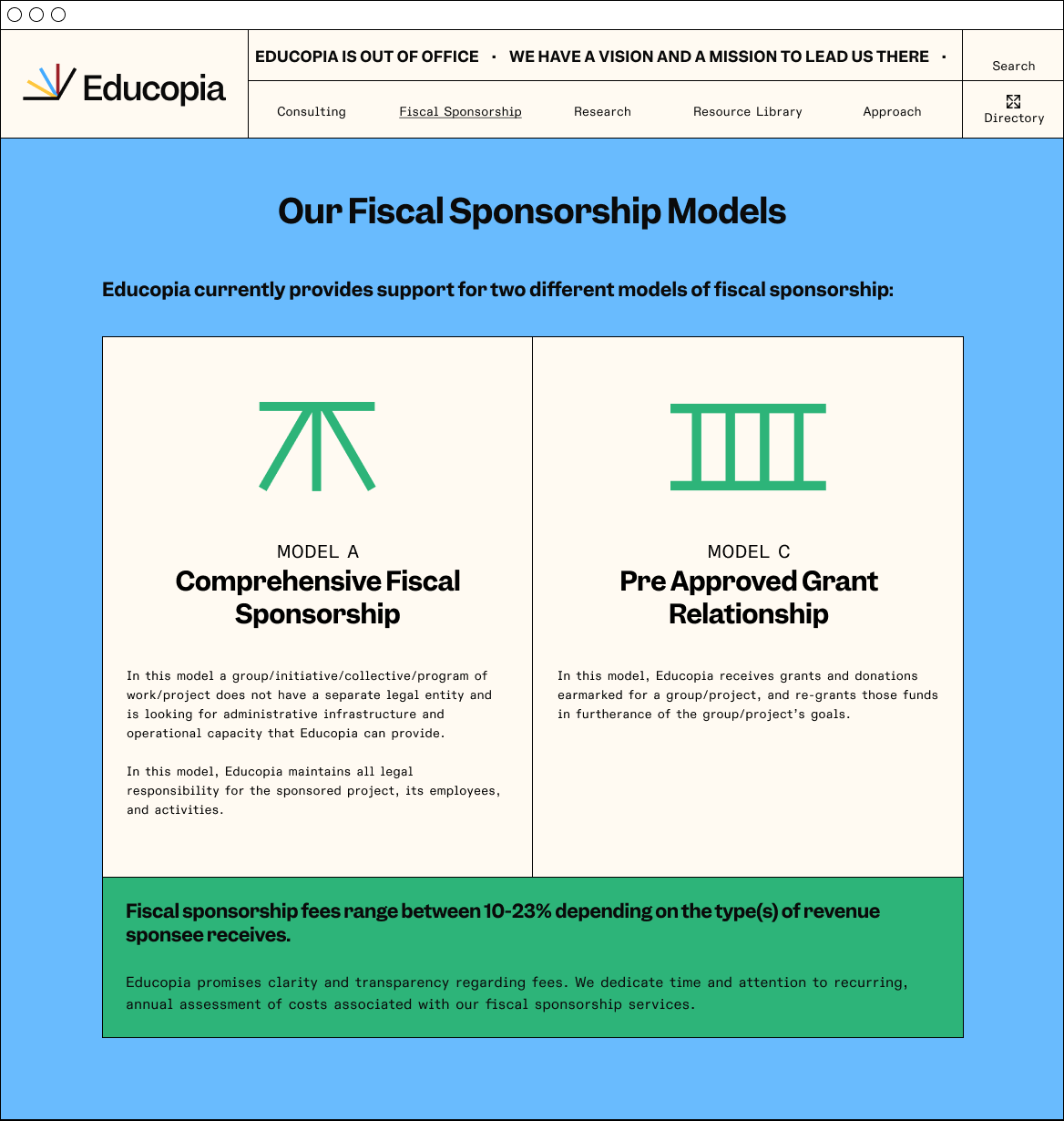
A simple set of basic icons is also used to make it easier for our audience to navigate and understand complex information.

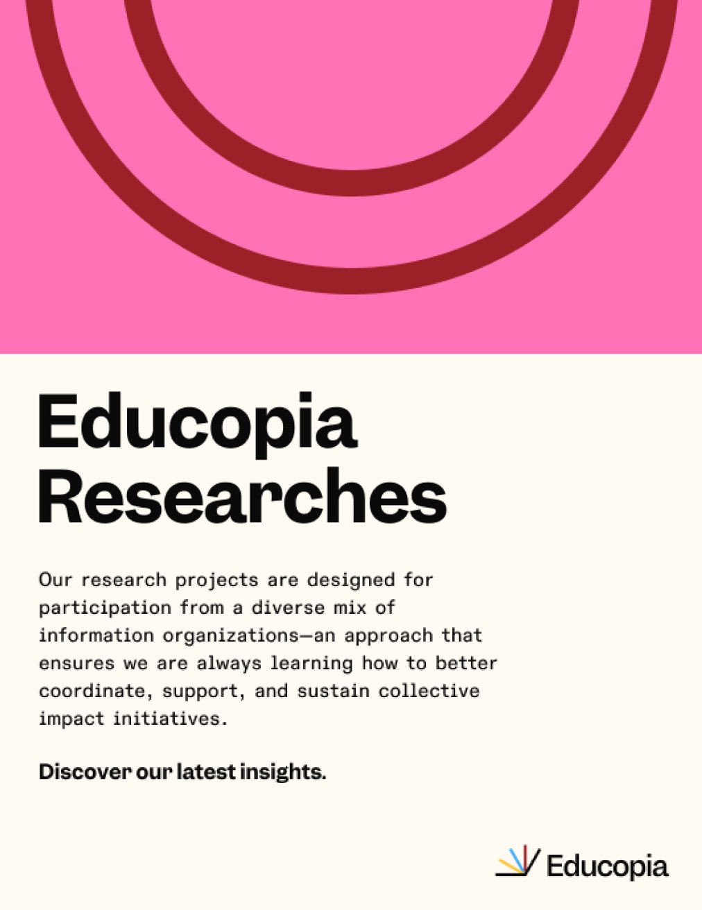
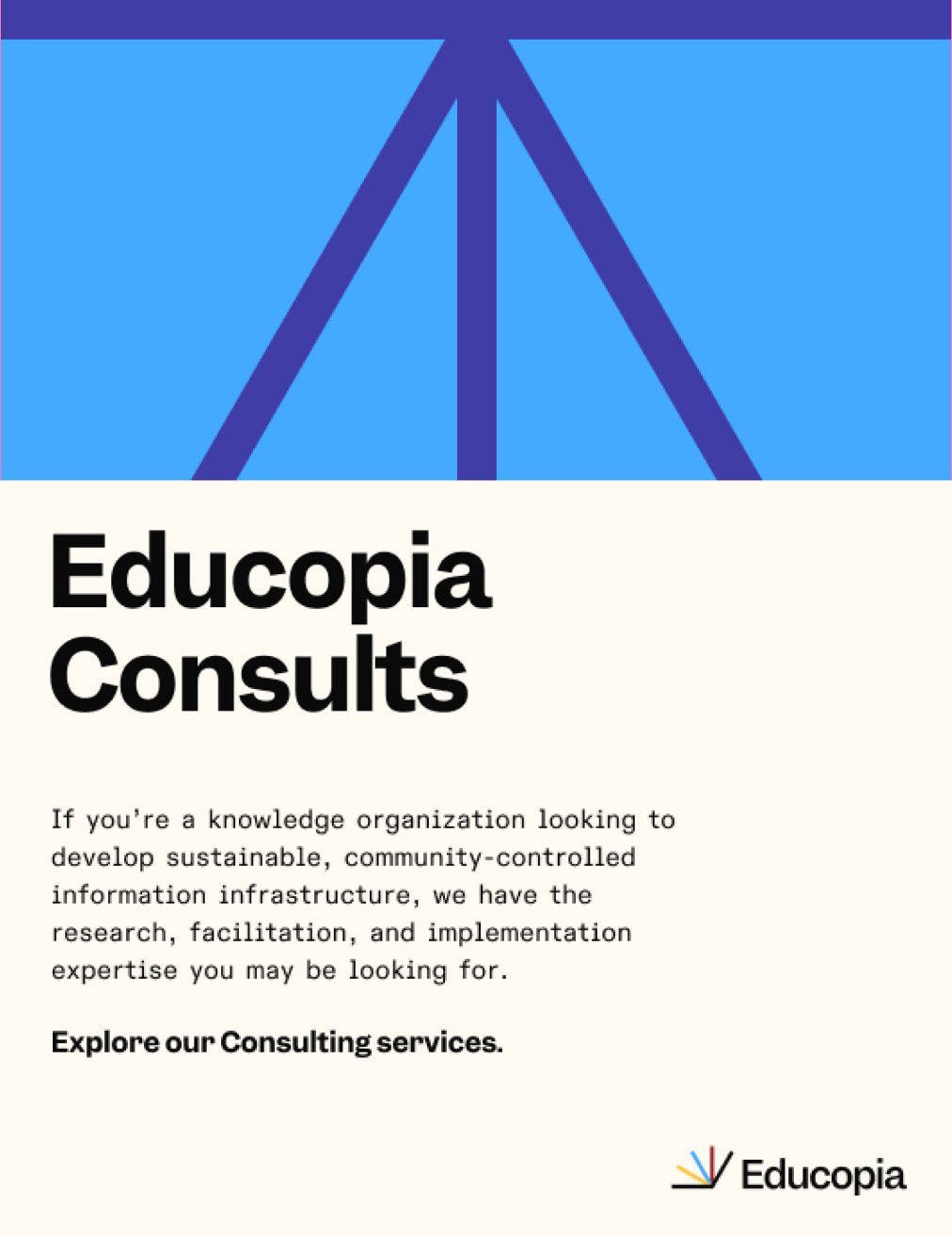

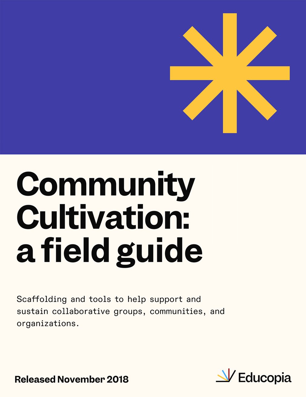
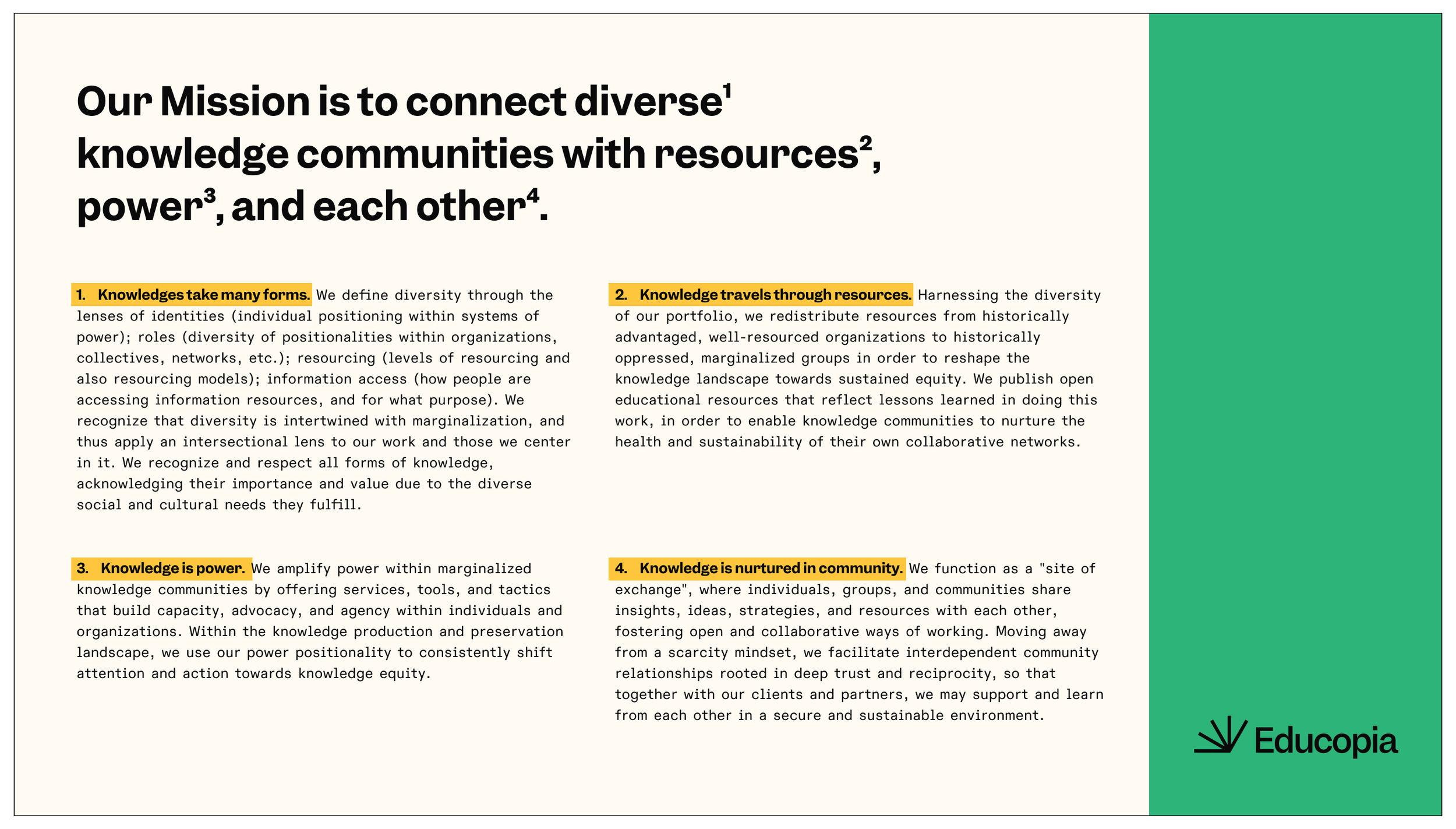
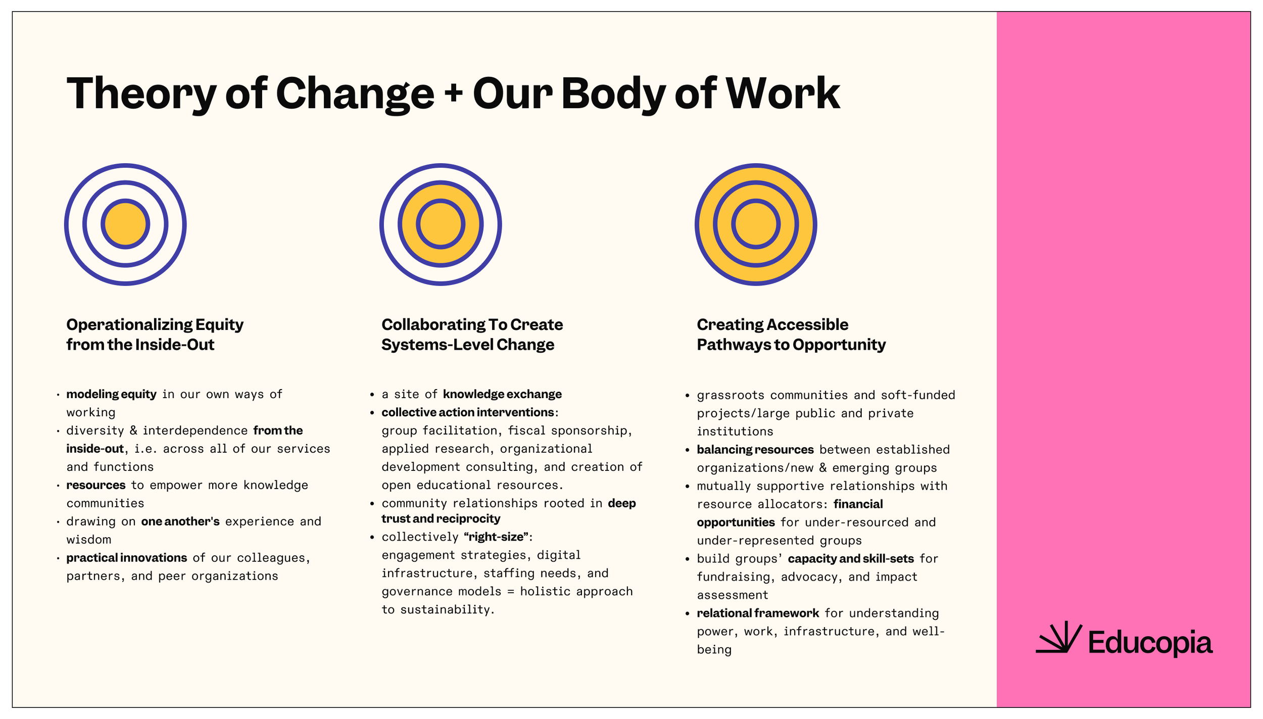
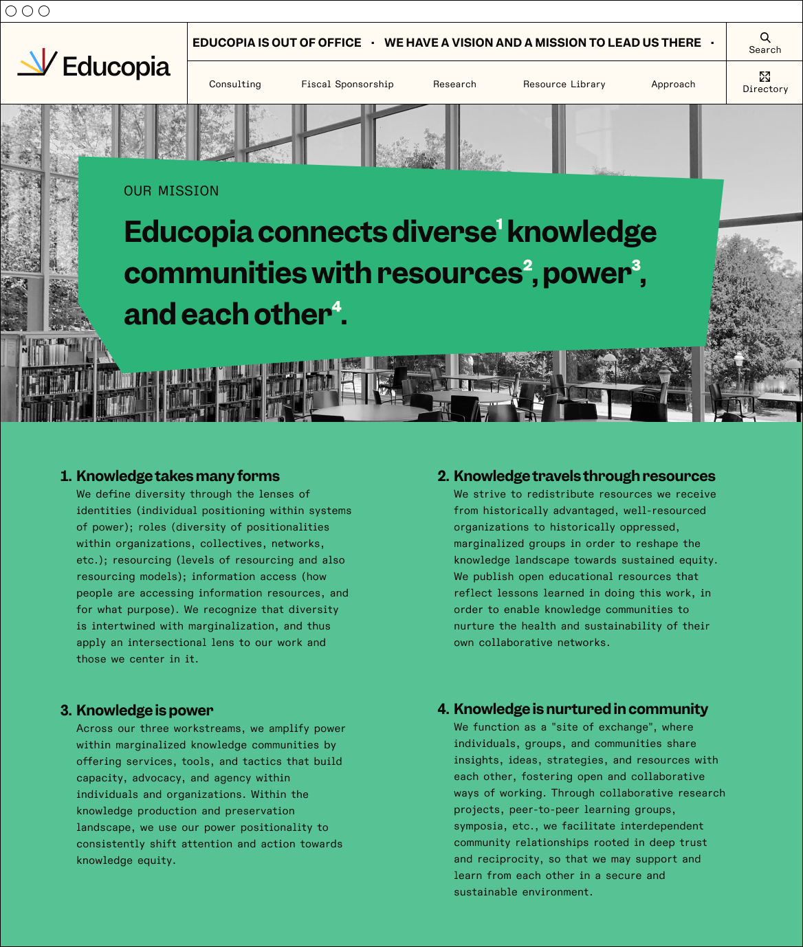
An important part of the visual identity is adhering to a grid. When possible, color blocks, photos and text align to your document’s grid to visually emphasize the Knowledgable core attribute.


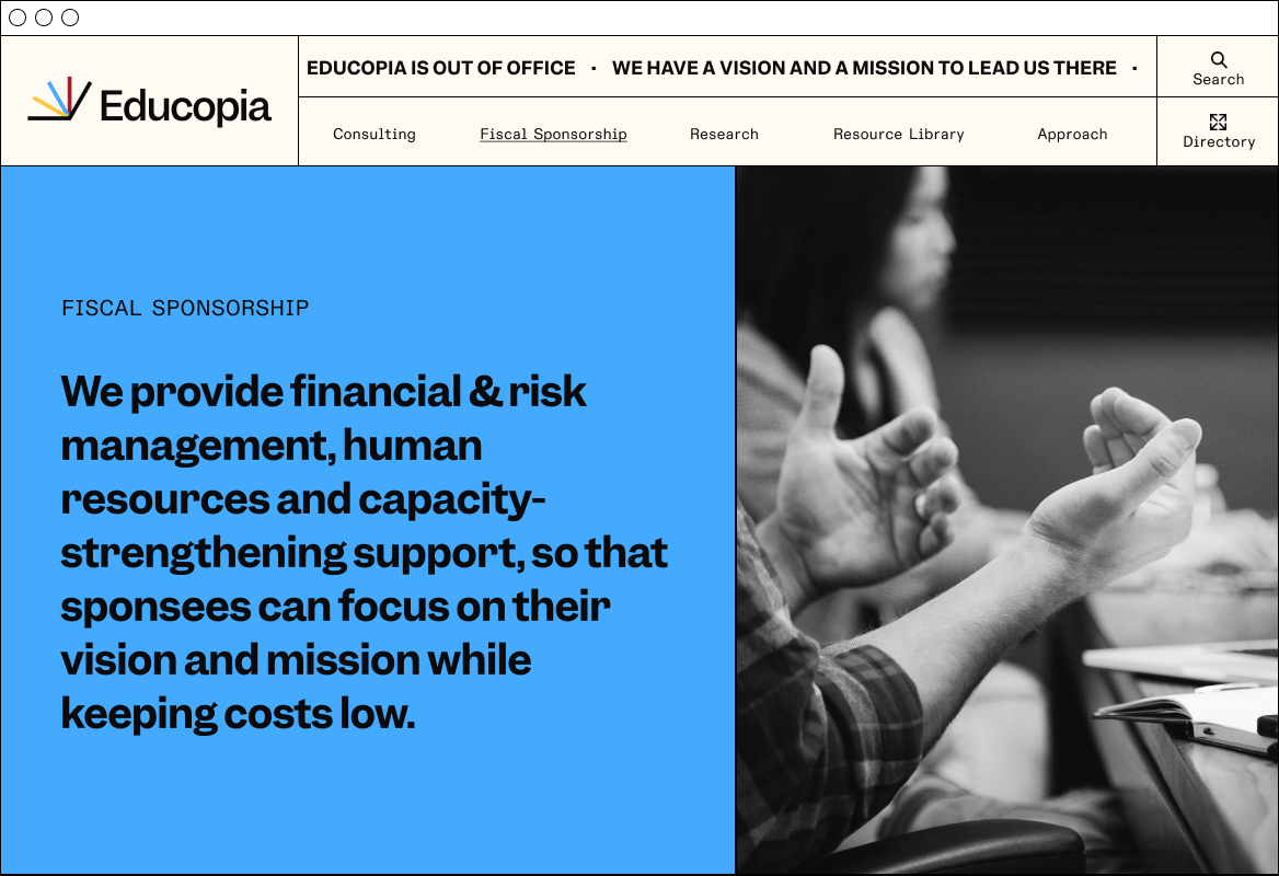
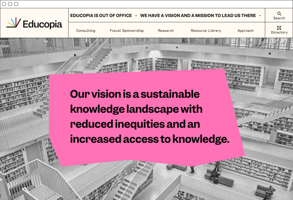
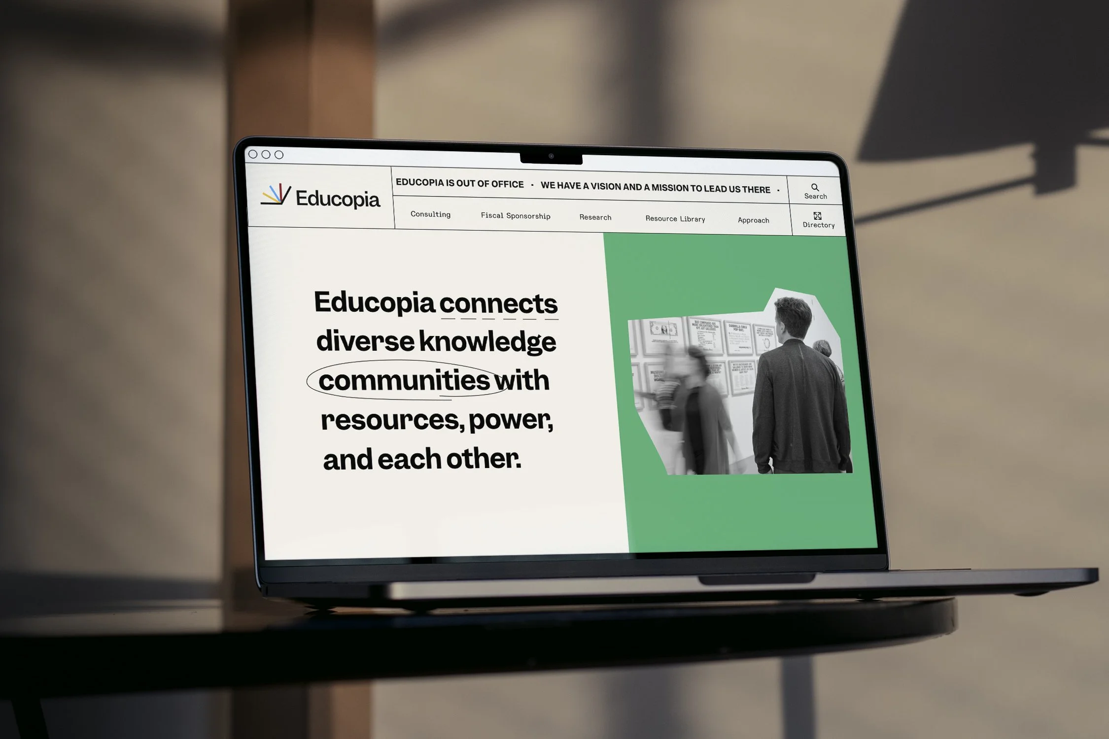
Photography plays a secondary role in the Educopia brand. We use open-source stock photography showing spaces, archives, or representations of systems. To unify the stock imagery, photos are converted to black & white.


Photos are also unified by being collaged onto a colored background that uses one of Educopia’s primary brand colors. This evokes our Collaborative and Progressive brand attributes.


